The US Department of Justice updated Title II of the Americans with Disabilities Act on April 24, 2024. Former U.S. Attorney General Merrick Garland signed the update requiring all universities, state and local governments serving 50,000 people or more to make their websites and mobile applications more accessible to people with disabilities.
Title II of the Americans with Disabilities Act says that “no qualified individual with a disability shall, by reason of such disability, be excluded from participation in or be denied the benefits of the services, programs, or activities of a public entity, or be subjected to discrimination by any such entity.”
The final rule on Title II of the Americans with Disabilities Act enacts the Web Content Accessibility Guidelines (WCAG) 2.1 AA. This will ensure that all materials in the digital space, including websites, mobile apps, documents, digital communications, multimedia content and course content, are accessible to everyone.
In U.S. higher education institutions, approximately 1 in 5 undergraduate students and 1 in 8 graduate students have a disability, and digital accessibility is a common gap in accommodations.
NC State University provided a Digital Accessibility Guide to ensure the following key accessible elements are included: links, alternative text, tables, color contrast, lists and video and audio headings.
NC State professors and professional staff must begin preparing to make all websites, courses and digital communications accessible to all, including those with disabilities.
Guide/Implementation
Are you trying to make your content more accessible? NC State provided a Digital Accessibility Guide for making digital communication more accessible. Here’s are the seven focus areas from that sheet:
Hyperlinks
Hyperlinks on websites, social media and PDFs are all magnets for inaccessible content, especially for those who use screenreaders, voice-control or keyboard-only navigation. To make sure links are accessible, the following must be completed:
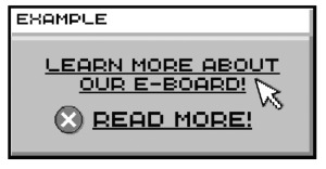
Link text should be a ‘descriptive text,’ meaning it should be concise and understandable. Avoid linking URLs or linking text as “Click Here” or “Read More” as this is undescriptive and confusing.
If email addresses are linked, spell them out to clarify that the link is an email address.
In the link text, specify if the link will download a file or open a new tab. For example, “Student Media Handbook (PDF)” or “The Nubian Message Website (opens in new tab)”
Do not underline text that is not a link.
Give links a contrasting color from the background and surrounding text.
Image Quality
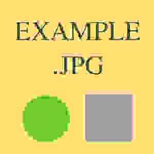
One of the biggest issues with images is readability. All images should have a high enough resolution so users can zoom in without the image becoming blurry.
Alt Text
Alt text “refers to the invisible description that is read to screen reader users to describe the nature or contents of an image.” Many images either lack alt text or have alt text that reads as a random number or words that are inaccessible to screen readers. Here are some tips to make sure alt text is accessible:
All images containing alt text must be purposeful. Remove any decorative or non-communitive imagery.
Alt text must be concise, descriptive and include all punctuation.
Any information included in a photo caption should not be included within the alt text.
Arizona State University has an image accessibility generator that uses AI to create descriptive alt text. Add an image into the machine, and it will generate alt text for the picture. As always, proofread all alt text before publishing.
In social media, keep all emojis and hashtags at the end of the sentence, as these contain alt text and disrupt sentence flow.
The University of South Carolina has a guide explaining how to add alt text to images on various social media platforms.
Tables
Tables are a major issue for screen readers. When possible, tables intended for formatting should be marked as such so screen readers don’t interpret them as data tables, which are formatted differently.
Color Contrast
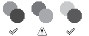
Color contrast is a highly important, yet mostly forgotten, aspect of making content accessible. Good color contrast ensures that your content is readable for those with low vision or colorblindness. Here are some tips to ensure good color contrast:
UNC Chapel Hill has several color contrast resources linked to help both with analyzing color contrast and ensuring colorblind accessibility.
Using accessible fonts is also a key factor for readability. Typically, most accessible fonts are sans-serif at 12 point minimum.
Use Bold, italics or full uppercase text sparingly.
Headings/Lists
When your text has a hierarchical structure, use lists. They’re available in Moodle, Google Docs and Microsoft Word.
When writing something in Moodle, users can click the ellipsis to open a toolbar, and click the numbered or bulleted list icon to start a list
In Microsoft Word and Google Docs, you can hit * and then space to create a bulleted list. You can also type 1. and add a space to create a numbered list.